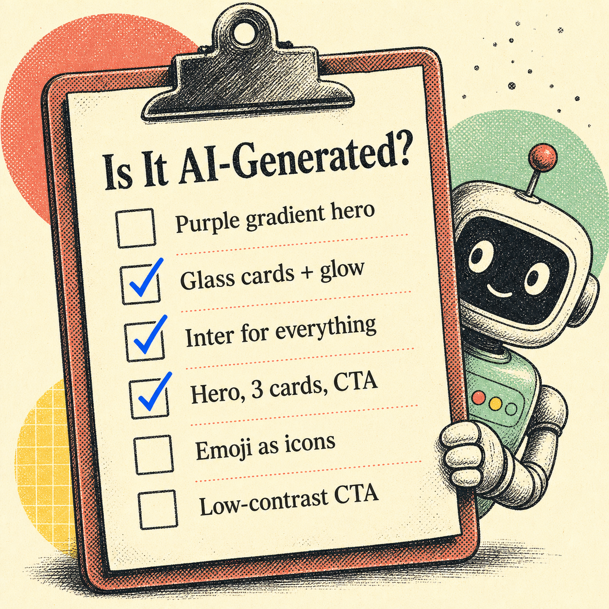
The fastest way to tell if a website was AI-generated is to look for the cluster, not any single:
- a dark hero with a purple gradient
- glass cards with glow shadows
- Inter for everything
- a hero→three-cards→CTA skeleton
- emoji feature icons
This is a field guide to that fingerprint — what to look for with your eyes, what to check in the code, and how to confirm it objectively instead of arguing about vibes. (If you want the why behind all this, start with What Is AI Design Slop?.)
The eye test: the visual tells
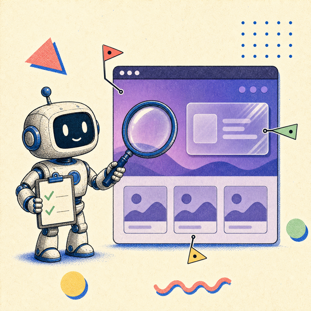
Most AI-generated sites share a small, repeating vocabulary. Score a site against this list — the more it hits, the more likely a model built it:
- The purple gradient hero. Indigo-to-violet, usually on a dark or near-black background. The single most reliable tell. (Here's why it's always purple.)
- Glassmorphism cards with a soft glow shadow, floating over the hero.
- Inter everywhere. One geometric sans, every weight, no contrast between display and body type.
- The skeleton: big hero, one-line subhead, a row of three identical feature cards, a centered call-to-action. Then repeat the three-card row for "testimonials" and "pricing."
- Emoji as icons. A rocket, a lock, a sparkle (✨🚀🔒) standing in for a real icon set.
- Everything centered. Centered headings, centered paragraphs, centered buttons, no asymmetry anywhere.
- Low-contrast everything. Light-gray body text, a CTA whose color barely separates from its background.
A handcrafted site usually breaks the pattern somewhere on purpose — an off-grid layout, a real typeface pairing, a color that isn't safe. Slop holds the pattern perfectly, because holding the pattern is all it knows how to do.
The code test: dead giveaways under the hood
Open dev tools and the tells get more specific:
bg-indigo-500/ indigo utility classes all over the markup — Tailwind's default accent, untouched.- Stock shadcn/ui component classes with no customization, straight from the generator.
- Generic class soup and repeated boilerplate sections that look copy-pasted because they effectively were.
- Placeholder content that shipped — "Lorem ipsum," "Feature one / Feature two / Feature three," or suspiciously generic marketing copy with no specifics.
- Emoji in the HTML where an icon component should be.
None of these are proof on their own — plenty of humans use Tailwind defaults and shadcn. But stacked with the visual tells, they corroborate.
The honest caveat: looking generic isn't a crime
Before you start calling every clean site "AI slop," a reality check. Conventions exist because they work — a login form that looks like every other login form is easier to use, not lazy. And the data is more nuanced than the meme: a 2026 study from Stanford, Imperial College London, and the Internet Archive found AI-heavy content is measurably more semantically similar, but found no statistically significant rise in stylistic homogeneity — even though 83% of people surveyed were sure it existed.
So "looks a bit generic" isn't a verdict. The thing actually worth flagging is where generic crosses into broken-for-users — and that you can measure.
The confirmation test: measure, don't guess
Eyeballing tells you "probably." Measuring tells you "definitely, and here's the receipt." The most useful signal isn't the purple — it's whether the defaults shipped real accessibility problems, because AI defaults reliably do.
Low-contrast text is the single most common accessibility failure on the web — present on 80%+ of homepages, per WebAIM's 2025 analysis. That low-contrast CTA the generator loves? It's not just a style opinion; it's the most common real defect on the internet, shipped by default. So the objective test is: open the rendered page and measure it.
- Contrast: sample the actual text-on-background ratios against the WCAG 4.5:1 line. The render is what counts, not the token you intended.
- Hierarchy and type scale: is there a real difference between heading and body, or is it all one weight?
- Responsiveness: does it reflow, or just shrink the desktop layout?
That's exactly what Pixelslop automates — it opens the page in a real browser, measures contrast, hierarchy, and layout at three viewports, checks the known slop patterns, and hands you evidence instead of an argument. "This feels AI-built" becomes a list of specific, fixable findings.
Frequently Asked Questions
How can you tell if a website was made by AI?
Look for the cluster of tells together: a purple/indigo gradient hero on a dark background, glassmorphism cards with glow shadows, Inter as the only font, a hero→three-cards→CTA layout, emoji used as icons, and low-contrast text. In the code, watch for untouched bg-indigo-500 Tailwind classes, stock shadcn/ui components, and leftover placeholder copy. Any one is common; all of them at once is the signature.
Is there a tool to detect AI-generated design?
Yes. Beyond eyeballing the tells, you can measure the rendered page. Pixelslop opens a site in a real browser and scores it on contrast, hierarchy, typography, responsiveness, and known AI slop patterns, turning "this looks AI-built" into specific, evidence-backed findings.
Does an AI-generated website always look bad?
No. AI-generated sites are usually competent and functional — that's the point of calling it "slop" rather than "broken." The real, measurable problem isn't that it looks generic; it's that AI defaults frequently ship accessibility failures like low-contrast text, which is the most common WCAG issue on the web.
Part of a series on AI design slop: What Is AI Design Slop? · Why Every AI-Built Website Is Purple