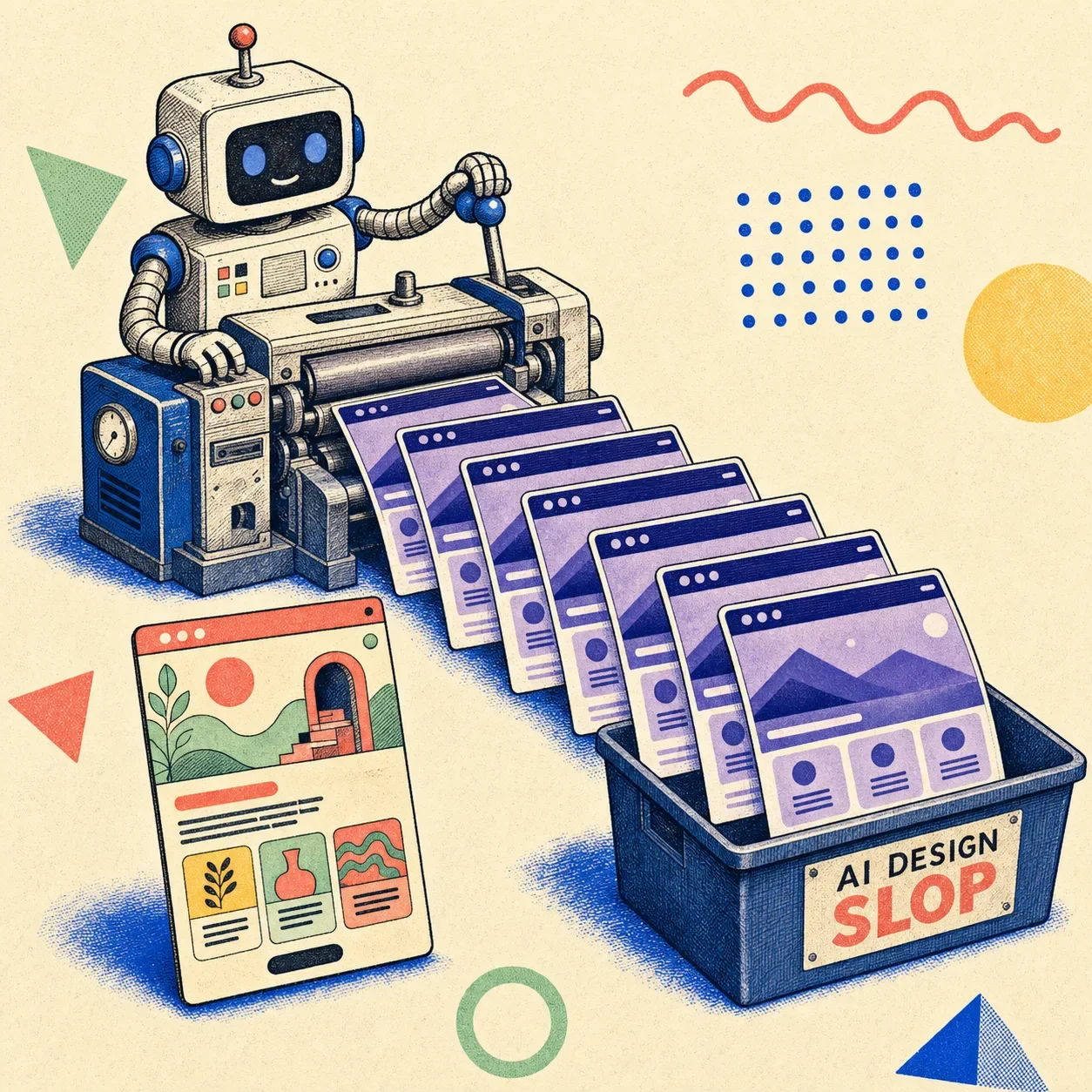
AI design slop is generic, interchangeable user interface that AI tools produce by default — the purple gradient, the glass cards, Inter everywhere, the three-column feature grid, the call-to-action nobody can read. It's not broken. It works, it's responsive, it ships. It just looks like every other AI-built page and says nothing.
That "competent but soulless" quality is exactly what makes it slop, and exactly why "but it works" was never the bar.
The word isn't mine, and it isn't niche anymore. In December 2025, Merriam-Webster named "slop" its Word of the Year, defining it as "digital content of low quality that is produced usually in quantity by means of artificial intelligence." Their write-up doesn't hold back: "like slime, sludge, and muck, slop has the wet sound of something you don't want to touch. Slop oozes into everything." It oozed into design too. This post is about the design half — what it is, why your AI keeps generating it, and how to catch it before it ships.
Slop is not the same as broken
Here's the distinction that matters. A broken interface fails — buttons don't click, layouts collapse, text overflows. You notice broken. Slop is worse in a quieter way: it's fine.
Wikipedia's definition nails the tell — AI slop has a "banal but realistic, easily processed style." It passes the squint test. It just has no point of view, and at scale it makes the whole web feel like one tab you already closed.
For design specifically, slop is the interface equivalent of the hedge-everything, says-nothing prose an LLM writes when you don't push it. Functional. Forgettable. Identical to the last hundred.
The tells: what AI design slop actually looks like
Open enough AI-generated pages and the pattern language jumps out:
- Purple. Indigo-to-violet gradients, gradient text on a dark background.
- Glass cards with a soft glow shadow, floating on a near-black hero.
- Inter. Everywhere. Forever. (Or its geometric-sans cousins.)
- The skeleton: hero → one-line subhead → three identical feature cards → a centered CTA.
- Emoji as feature icons. ✨🚀🔒, arranged in a row of three.
- A call-to-action button sitting at maybe 2.5:1 contrast — technically there, practically invisible.
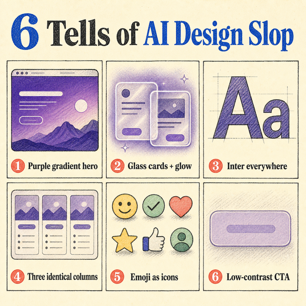
None of these are crimes on their own. Each is a safe, reasonable default. Stack them on every page across the whole internet and you get slop: a monoculture of the inoffensive.
Why your AI keeps building the same purple website
This is the part people get wrong by hand-waving about "AI has no taste." The real answer is more specific, and more interesting.
It's literally a default that escaped. The most-told version of this story is about one color. Adam Wathan, who created Tailwind CSS, picked indigo as the default accent for Tailwind UI's components — by his own later admission, a "neutral, inoffensive placeholder that worked well in demos." Not a design decision. A placeholder.
Then language models trained on billions of tokens of web code scraped from 2019 to 2024, where a disproportionate share used bg-indigo-500, and they learned a statistical "truth": purple buttons are what buttons look like. AI then generated more purple sites, which became new training data, which deepened the bias. Wathan's 2025 tweet half-apologizing for it racked up over a million views. One inoffensive default, fed back through the training loop, repainted a chunk of the web.
The math underneath rewards the average. Generative models regress to the mean by construction, and there's peer-reviewed work explaining why distinctiveness dies first:
- Model collapse (Shumailov et al., Nature, 2024): when models train recursively on AI-generated data, they degrade — and they lose the tails of the distribution first. The rare, weird, distinctive choices vanish before the average ones. Design's long tail is exactly where taste lives.
- Typicality bias (Verbalized Sampling, Stanford-affiliated, 2025): the people who rate AI outputs during training systematically prefer familiar, typical answers — a cognitive-psychology bias. Preference tuning then sharpens the model toward the typical. Safe wins. Surprising loses.
- Knowledge collapse (2025): across 27 models, 155 topics, 12 countries, and 200 real prompt templates, every model tested was "less epistemically diverse than a basic web search." Generation narrows the range of what you even see.
And it's not just text. A March 2026 paper studied non-coders "vibe-coding" websites — prompting for goals instead of writing code — and found they "inadvertently narrow the diversity of their designs," because "the push for frictionless generation can exacerbate homogenization." The faster and more default-driven the generation, the more it converges.
So: it's always purple because of a placeholder, and it's always average because averaging is the job.
The honest part: is the "everything looks the same" thing even real?
Mostly — but not in the lazy way people say it, and pretending otherwise would make this whole argument easy to dismiss.
The biggest study on this is worth sitting with. Researchers from Stanford, Imperial College London, and the Internet Archive analyzed 33 months of the web (published April 2026) and found that by mid-2025, ~35% of newly published sites were AI-generated or AI-assisted — up from basically zero before ChatGPT. AI content was 33% more semantically similar than human content. So far, so monoculture.
But the data has a twist: they found no statistically significant increase in stylistic homogeneity — even though 83% of people surveyed believed AI was flattening everyone into one voice (the most widely-held belief they tested, and the data didn't back it). What the data did confirm was semantic contraction and a 107% jump in artificial positivity.
Read that carefully, because it's the key to not sounding like a crank: the strong, provable claim is about semantics and visual defaults, not a measured "every site is stylistically identical." AI converges on a small set of visual defaults (the indigo story is mechanism, not vibes) and on similar meanings. It has not been proven to erase writing style wholesale. The truth is narrower than the meme — and narrower is more useful.
What slop actually costs you
If it works, why care? Three real costs, in order of how much they should worry you:
- Accessibility, measurably. This is the one that isn't an opinion. Per WebAIM's 2025 analysis of the top million homepages, 96%+ have detectable WCAG failures, and low-contrast text is the single most common one — on 80%+ of sites. Automated tools only catch 30–40% of issues, so it's worse than it looks. That gorgeous low-contrast CTA the AI loves? It's the most common accessibility failure on the web, shipped by default.
- Differentiation. When generation is free and everyone reaches for the same defaults, looking like everyone else is a strategic loss. Nielsen Norman Group's State of UX 2026 puts it bluntly: "anyone will be able to make a decent-looking UI," and "when everything gets an AI sparkle, it becomes noise, not novelty."
- Trust. Figma's 2025 AI report (2,500 users) found 78% say AI boosts their efficiency, but only 32% trust its output. People can feel the gap between fast and good.
How to catch it (and what beats it)
The fix isn't "stop using AI." It's adding the step the generators skip.
Measure the rendered page, don't trust the stylesheet. Most design linters parse your CSS and guess what the page looks like. That misses the thing that matters — what actually rendered after every cascade and override fought it out. If your CTA resolves to 2.5:1 on screen, you want a tool that sees 2.5:1, not the nice token you meant to use.
That's the whole idea behind Pixelslop: open the real page in a browser, measure contrast, hierarchy, and layout at three viewports, and flag the slop patterns with evidence instead of vibes.
Generate with taste, then verify with evidence. The two halves go together. Stitch Kit is about teaching AI agents to generate good UI in the first place; Pixelslop is about catching what slips through. Generation gets you to "plausible" fast — verification is what gets you to "actually good."
Keep a human where taste lives. NN/g's read for 2026 is that the automatable part of design — assembling components from a system — is exactly the part AI now does, while "curated taste, research-informed contextual understanding, critical thinking, and careful judgment" resist automation. When the baseline is free, taste is the moat.
Frequently Asked Questions
What is AI design slop?
AI design slop is generic, interchangeable UI that AI tools generate by default — purple/indigo gradients, glassmorphism cards, Inter as the only typeface, identical three-column grids, and low-contrast CTAs. It's distinct from broken design: it renders and works, it just looks like every other AI-built page and lacks any point of view.
Why do all AI-generated websites look the same?
Two reasons. First, defaults: tools:
- Tailwind shipped indigo as a placeholder accent
- that color saturated the code AI trained on
- deepening the loop. Second
- preference tuning rewards familiar
- typical outputs over surprising ones
Is AI design slop actually a problem, or is it just snobbery?
Some of it is taste-policing — conventions genuinely help usability, and a login screen that looks like every other login screen is good. But there's a measurable cost that isn't opinion: low-contrast text is the most common accessibility failure on the web (80%+ of homepages, per WebAIM 2025), and AI defaults make it worse. Sameness is a branding problem; bad contrast is an everyone problem.
How do I tell if a website was AI-generated?
Look for the cluster of tells together: a dark hero with a purple/indigo gradient, glass cards with glow shadows, Inter everywhere, a hero→three-cards→CTA skeleton, emoji feature icons, and CTAs you have to squint to read. Any one is fine; all of them at once is the signature. To confirm objectively, measure the rendered page for contrast and layout rather than eyeballing it.
How do I stop my AI-built UI from looking generic?
Add a verification step after generation. Let the agent build, then measure the result against real criteria — contrast ratios, hierarchy, type scale, responsiveness — and fix what fails before it ships. Tools like Pixelslop automate that "generate then verify" loop. The bigger lever is keeping human taste and judgment in the process, since that's the part AI can't replace.
Building UI with an AI agent in the loop? Pixelslop opens your real pages in a browser, measures the actual pixels, and catches the slop before it's live — no pitch, just the tool.